THE BRIEF
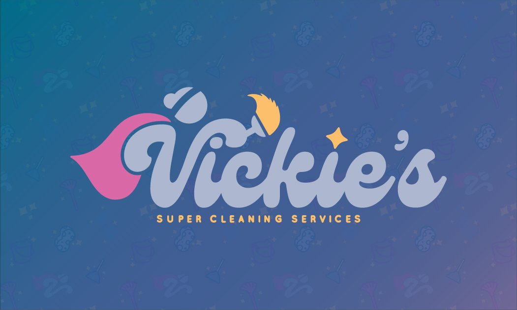
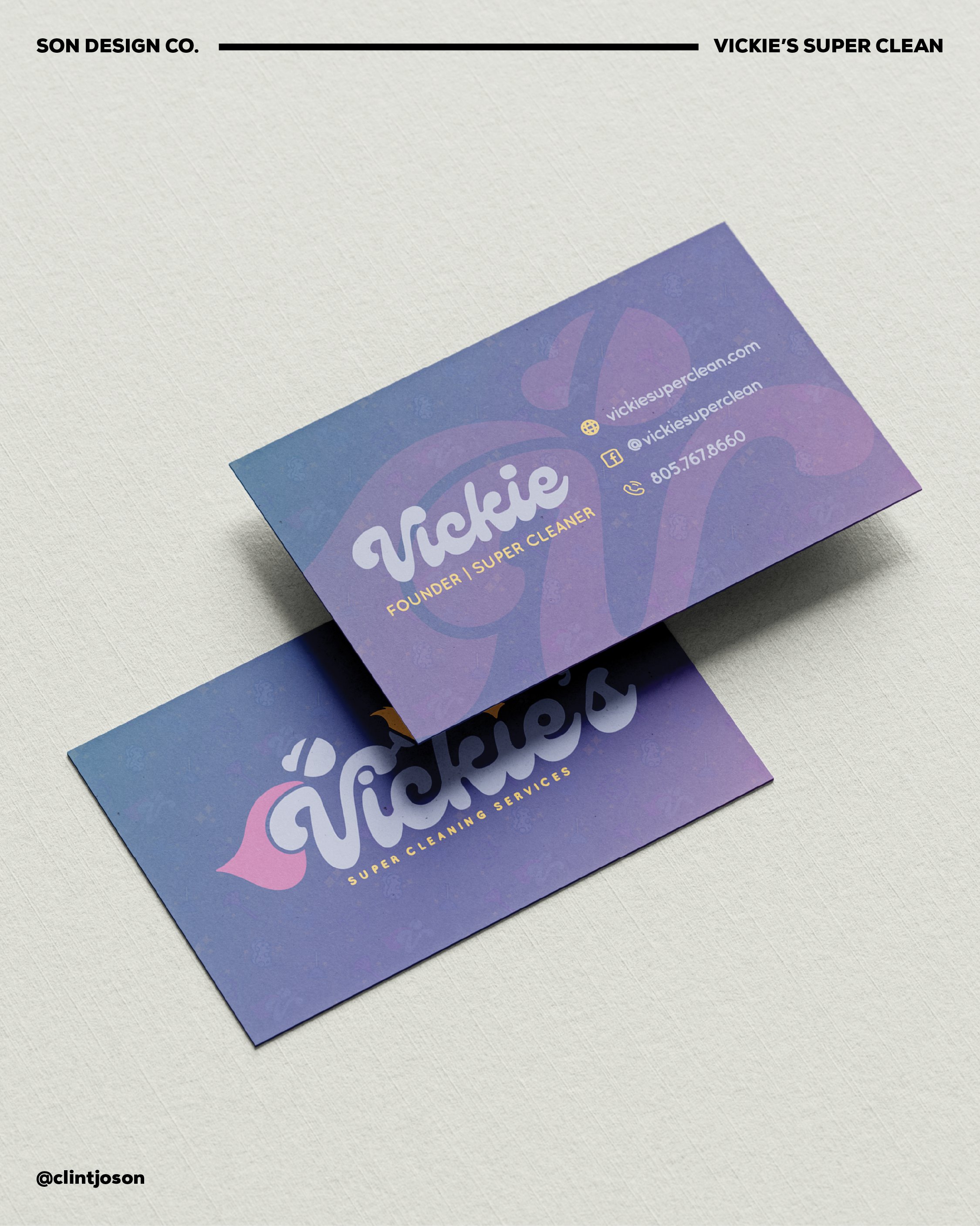
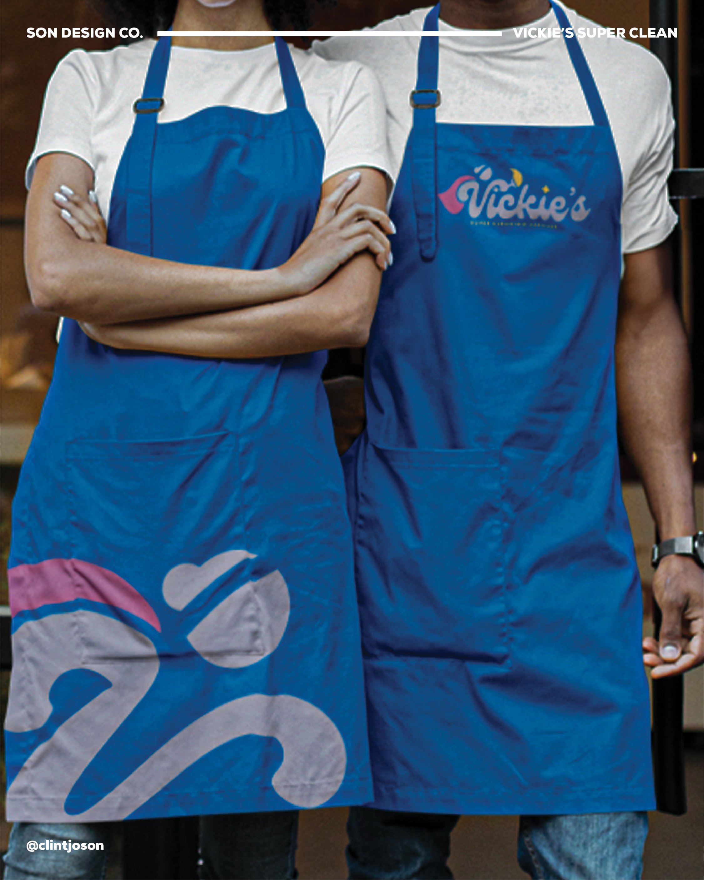
Vickie’s Super Clean; my first freelance client since relocating to California. A passion project and surprise to the owner of the business. The "V" stands for Vickie, the business owner, and forms the central body of the character: dynamic and leaning forward, suggesting motion, energy, and efficiency.
A simple, soft-edged head sits atop the V, personifying it subtly without overwhelming the shape, keeping the focus on the graceful curves of the script.

original logo
Inspired by past branding that nodded to Superman, this version embraces the superhero theme in a feminine, pastel-toned aesthetic, representing Vickie's powerful yet approachable presence. The script font style captures both the elegance of her touch and the swiftness of her services.